Last weekend I didn’t upload any artwork but I did make a bunch of stuff these last 2 weeks. These are all silly and I do realize that they are not great but I think I do see some improvement. I really only started doing any kind of painting/sketching last year, around February 2024. Before that, I really didn’t think that drawing is something I’d enjoy or was even good at. Times are a-changin’ 🙂
These artwork are not in chronological order. I do want to try and improve my art as much as possible. So, taking inspiration from my life as a software engineer, I’ll do a mini retrospective on each of these, focusing on 2 things I liked and 2 things I wish to improve. Of course, any feedback from you is always welcome, too.
To begin with, I’ll share some master studies I did. I know there’s a certain taboo in the art world regarding sharing master studies after contemporary artists on the Internet. While I do not condone ripping off other artists and taking credit for their creative ideas, I do think it’s valuable to give public credit to other artists that inspire us and whose work we study and refer to (much like in an academic/scientific paper it’s important to list all our references). If I ever get close to being an artist I want to be, I’d like there to be a trail of all the artists that helped and inspired me to get there. So, without much ado here they are:
- Master study after Dice Tsutsumi
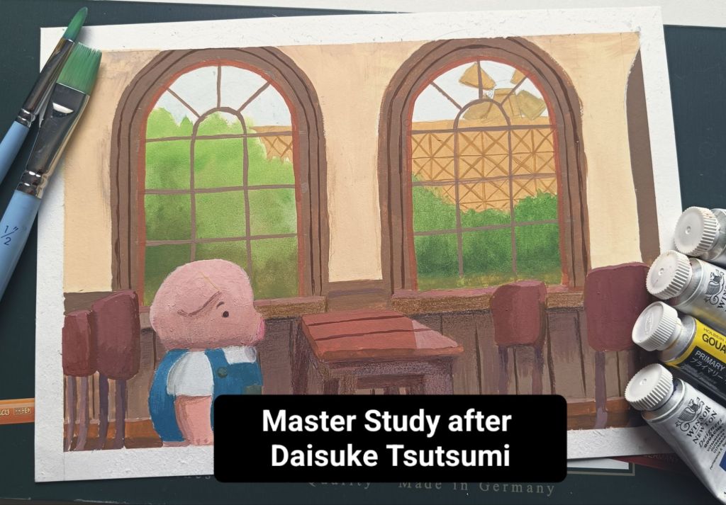
After taking Robert Kondo’s and Dice’s course on Painting with Light and Color on Schoolism, I decided to paint one of the scenes that Dice painted 5 versions of. I did more than 30 still life/scene studies during this course but I still have ways to go. In one of the lessons, Dice paints the same scene in 5 different lighting setups. He does it using digital media but I wanted to do these traditionally. This first one is the neutral, diffused light setup and I used gouache for this one. It took me nearly 1 month to finish it – something I want to rectify.
Things I like:
- I like how I painted the trees using wet in wet
- I do like the chair on far right
Things I want to improve:
- Pig’s color got very muddy.
- The table in the center doesn’t have the correct perspective.
2. Master study after Chris Hong
Much like most artists and aspiring artists around my age, I adore Chris’ work. I especially love her portraits. My favorite thing about them is how much of the form and emotion she is able to communicate without over-crowding her work. It’s something I really do struggle with (as will be evident in the coming up portraits). I have taken 3 of her courses on Skillshare and I plan on taking her watercolor course when I’m back in Switzerland (where my watercolors are 😁).
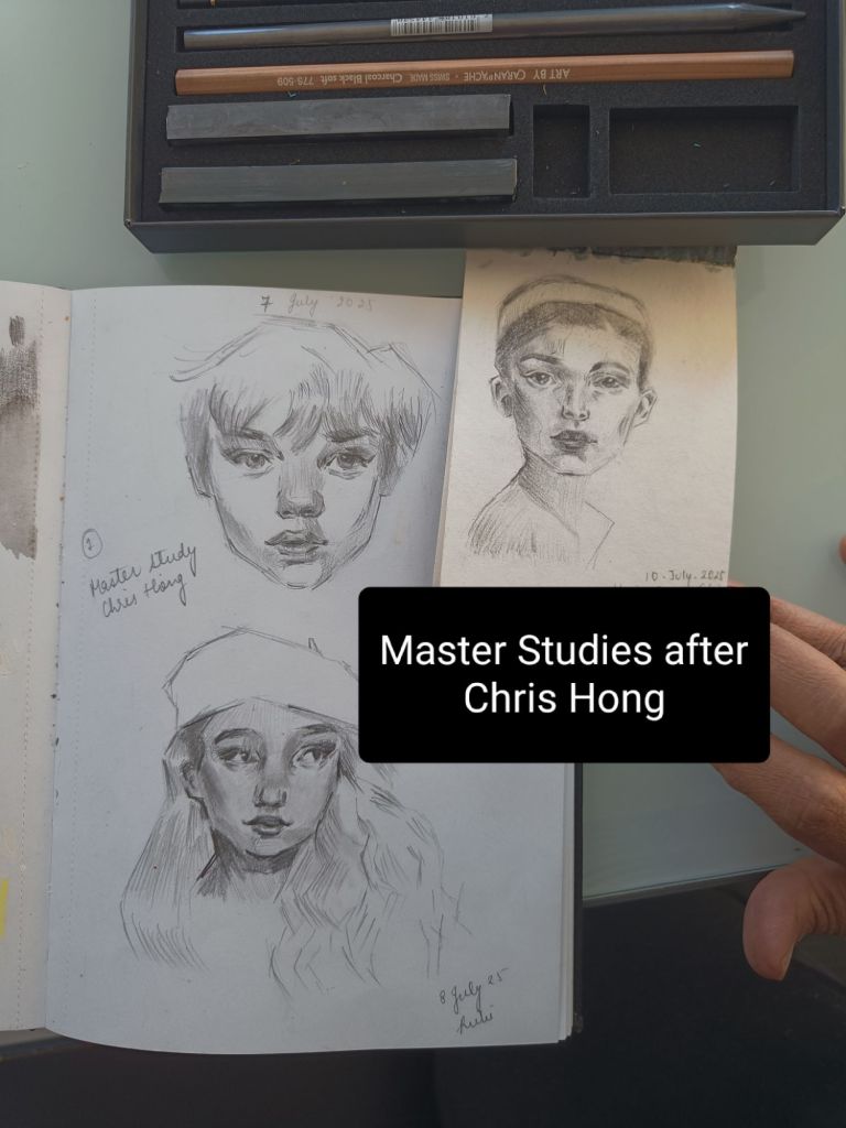
Things I like
- Ratio of white vs gray/black space
- Composition of hair
Things I want to improve:
- Lips
- Ball of the nose
Now time for some reference studies for portraits. These are not master studies. I just found some references on Pinterest. I’ve decided to ride the wave of 100 heads challenge. I plan on doing 1 portrait everyday. I’m super embarrassed about these but… I need to get over myself.
- 10 July 2025
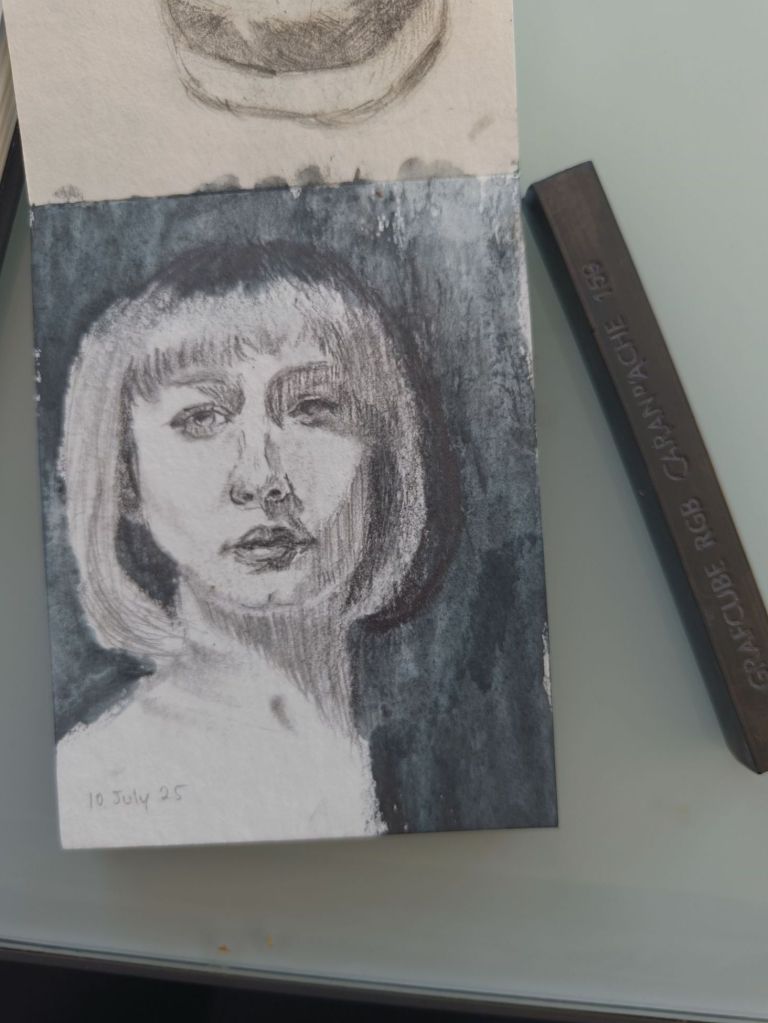
Things I like:
- The proportions are quite good
- The value grouping is okay
Things I want to improve:
- Be neater/less lazy with the blue charcoal
- Include some hard edges too
2. 11 July 2025
These are truly horrifying. I couldn’t bring myself to take a better picture of these. When they are vertical (instead of at an angle as shown here), the flaws are wayyy more apparent 😅.
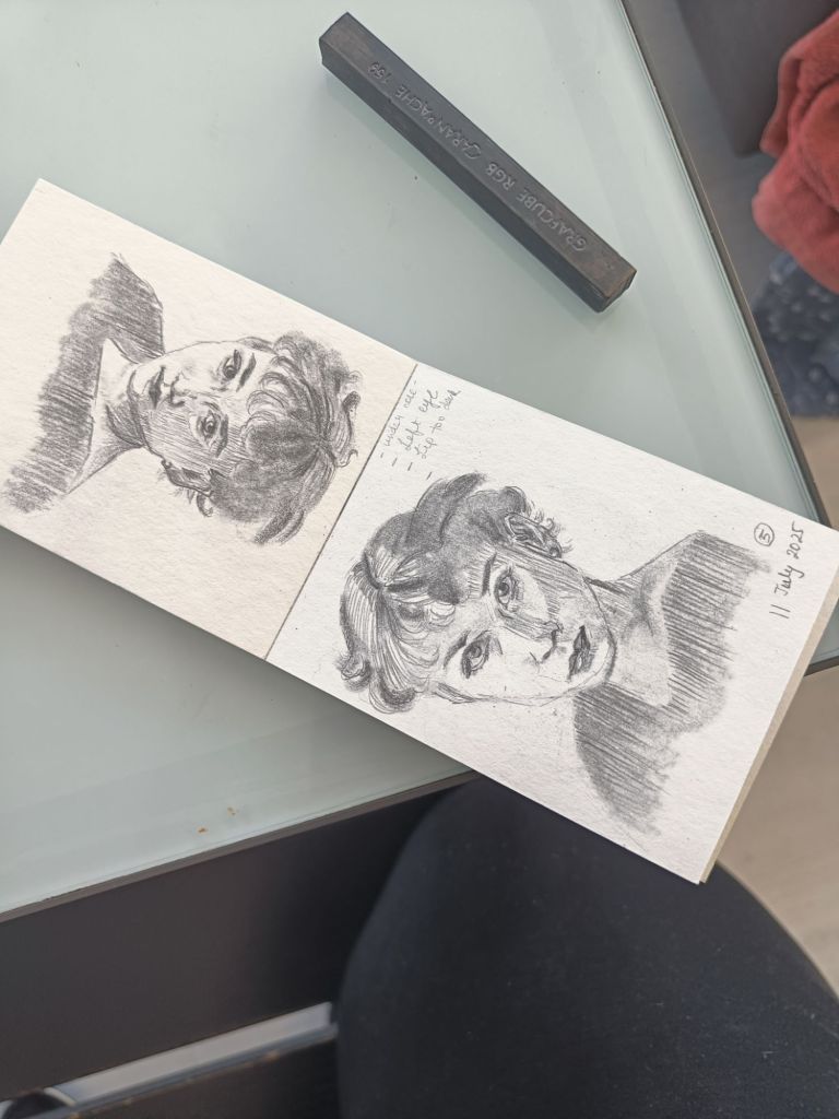
Things I like:
- A for effort – I drew the same head twice (albeit unsuccessfully) which is something I almost never do. I didn’t do it a third time because I was really sick of it.
- I guess the eyes are ok.
Things I don’t like:
- The proportions are obviously very bad
- The hair is unnecessarily complex I think.
3. 12 July 2025
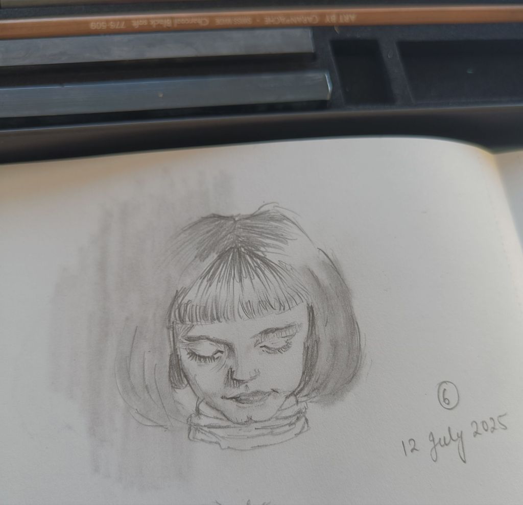
Things I like:
- Hair
- I only had 20 minutes this day so I like that I still showed up and decided to simplify the portrait
Things I don’t like:
- The difference in the value of the 2 sets of eyelashes
- Corners of the mouth
4. 13 July 2025
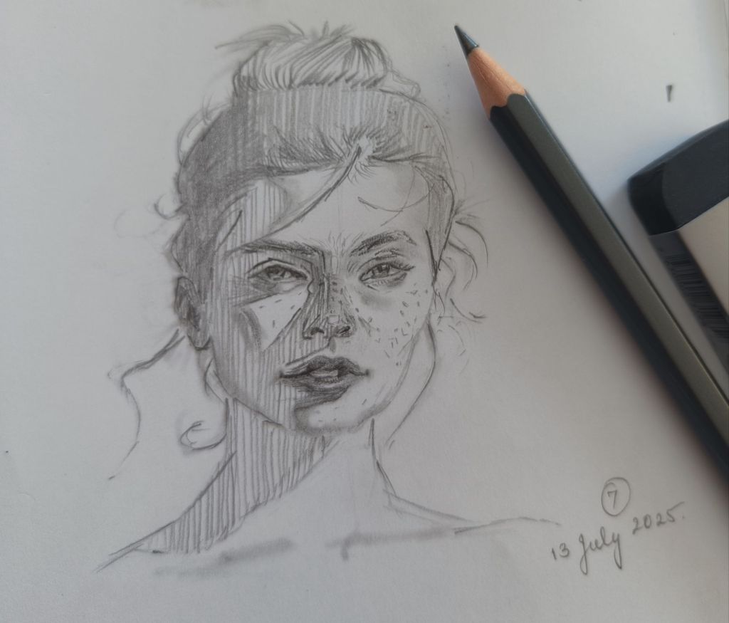
Things I like:
- I do like the rendering on her right (our left) cheekbone.
- I like that the freckles on her left (our right) cheek follow the planes of her face (more or less).
Things to improve:
- Somehow her hair looks like tentacles. Maybe I should have used softer edges and/or not added quite as many? Not sure.
- Her nose has pretty much the same value all over making it look kinda flat
On to the next thing. I did a little still life study in gouache today. I think the biggest lesson I’ve learned from the aforementioned course on painting with light and color is just how important it is to paint from life. I set up nearly all the ingredients of my favorite Spanish dish – pan con tomate (minus the bread) in a somewhat diffused/non-direct lighting.
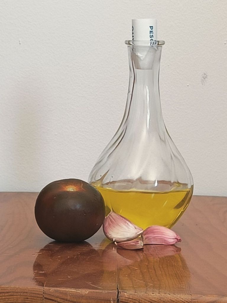
And here’s my painting. It’s obviously far from perfect but I really did enjoy the process and I see potential in the painting.
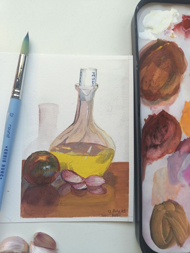
Things I like:
- The tomato – not quite sure why
- The cap on the olive oil bottle looks good I think. It shows the curved nature of the cap.
Things I want to improve:
- I mean, clearly the bottle looks wrong. To begin with I wish I had spent a bit more time on the sketch and nailed the shape of the bottle.
- Next, I know whites are difficult to paint. My choice of that mauve color for the wall behind the bottle just doesn’t work. I need to practice transparent materials.
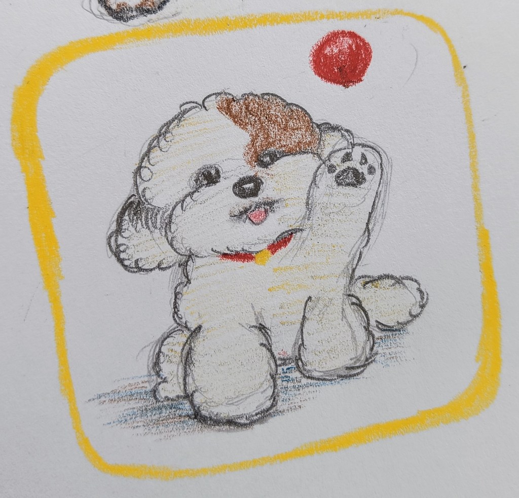
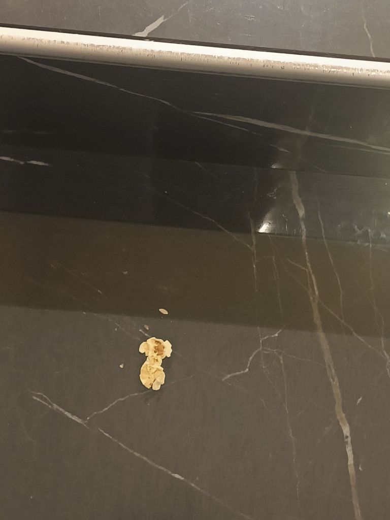
Finally, I made a fun sketchbook spread today purely for the heck of it. It’s not meant to be great or improve any particular skill. It’s a simple, guilty pleasure mostly inspired by this popcorn I found on the ground when I went to watch the new Jurassic park movie yesterday.
It looked like a poodle to me so I decided to draw it. This is how it turned out. I love it!!
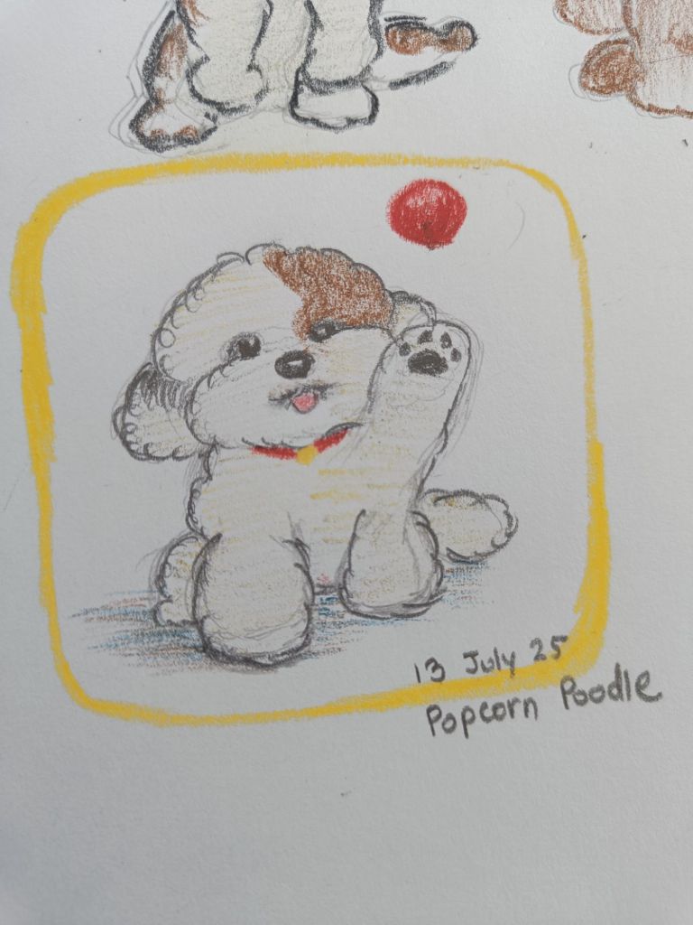
Do you see the semblance?
This is the whole spread. The Popeye doodle is taken from this wall art. I have absolutely no complaints about this. It’s everything and every color that I like.
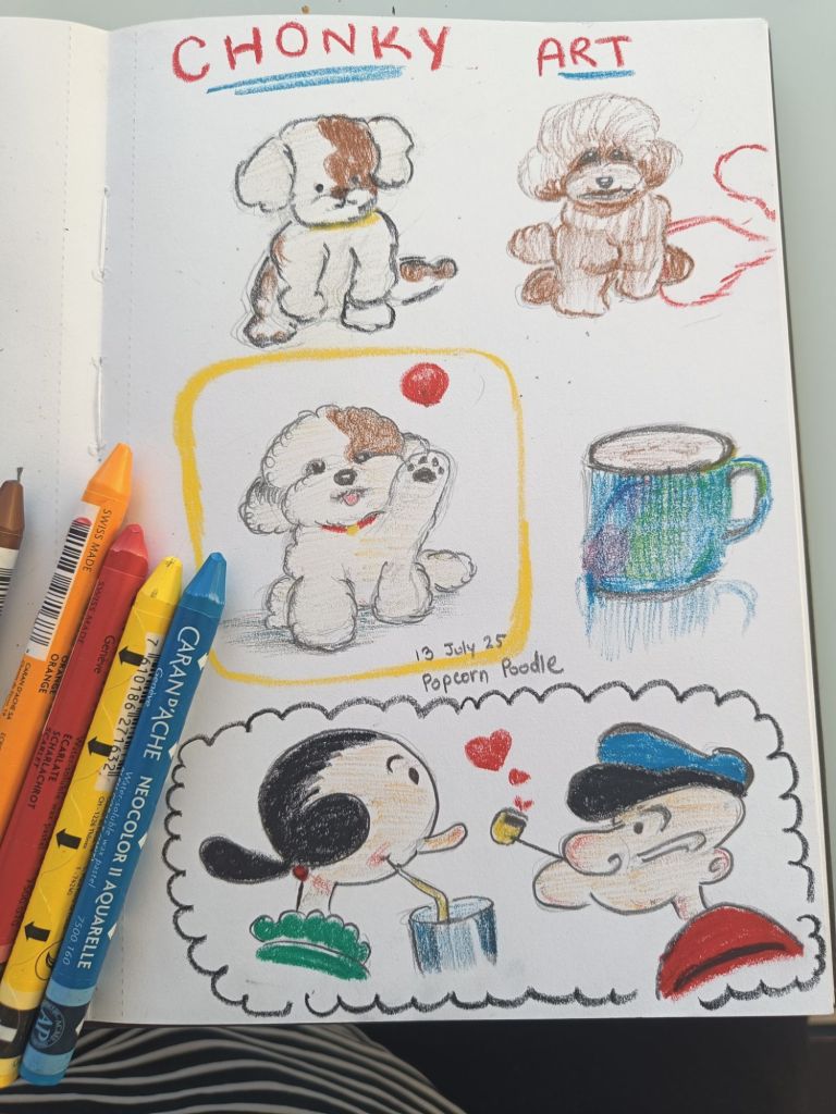
The poodle on the top left was my first attempt at drawing the dog that looked like the popcorn. It was okay. Then I decided to do a quick study of a poodle from Pinterest. That’s the one on top right. After that I was ready enough to draw the final popcorn poodle.
This has been a long blog post. I was so happy I got to do so much art these 2 weeks. I hope the trend and the tiny steps to progress continue.

Leave a comment